Coated art paper
A starting point for detailed graphics, photography and printed color across the full surface.
Confirm: the printed artwork and its appearance after the selected coating or lamination.
Paper sets the feel. Print carries your color. Finishes bring emphasis. Choose the details that work together, not just the ones that look good on their own.
Already choosing a box shape? Browse box structures, then use this guide to refine the details.
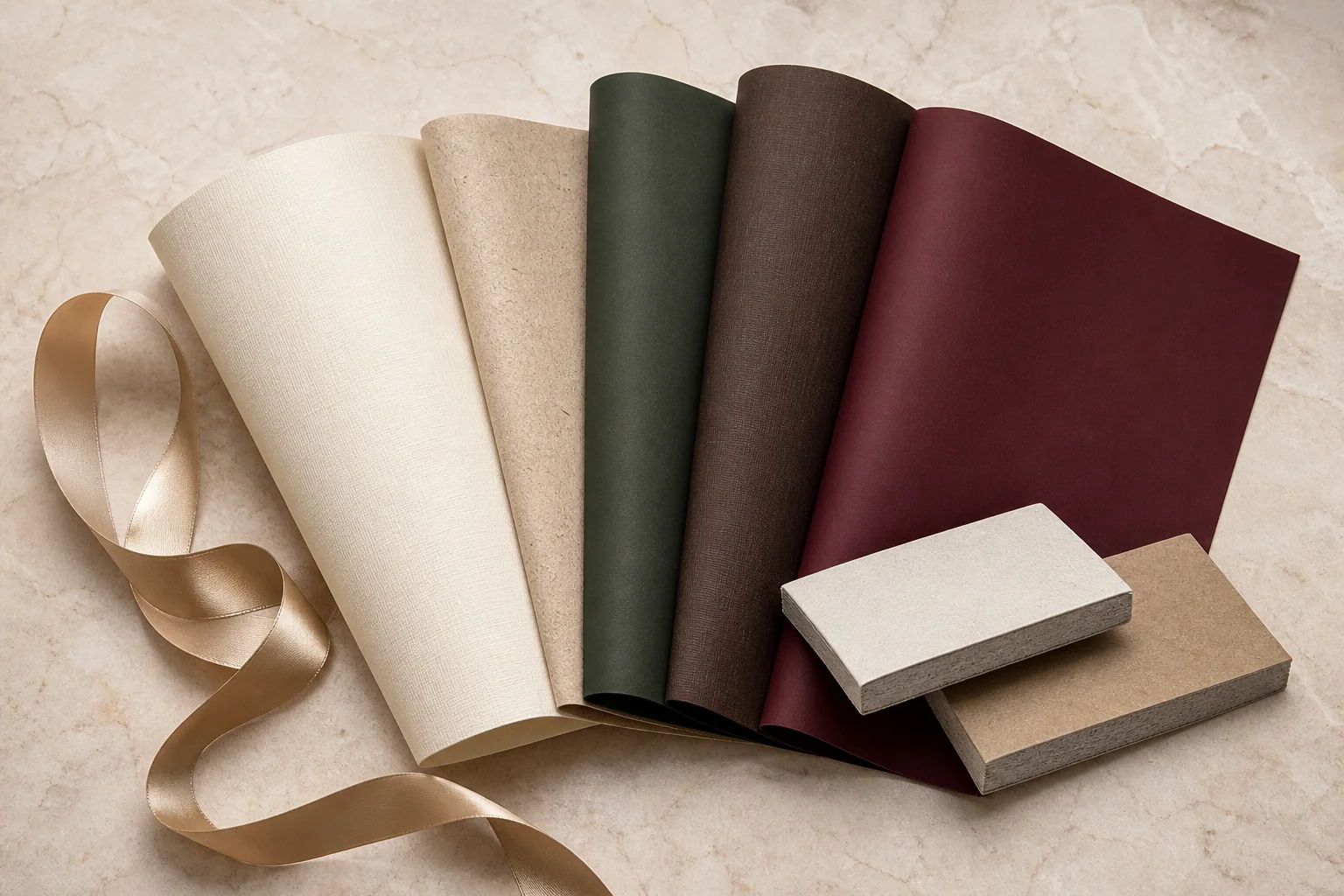
The outer wrap determines how the box looks and feels; the board beneath provides structure. Specify both rather than treating “thicker paper” as a complete material choice.
A starting point for detailed graphics, photography and printed color across the full surface.
Confirm: the printed artwork and its appearance after the selected coating or lamination.
Let the grain or tactile surface do more of the visual work, with restrained printing or a simple logo.
Confirm: whether fine lettering and foil edges remain clear on the actual texture.
Use an existing paper shade as the base instead of relying on a large printed background.
Confirm: available shades, batch reference and the appearance of folds and exposed edges.
A warm, fiber-led surface for an understated presentation and limited-color artwork.
Confirm: how the brown base affects your printed colors; a white-paper proof is not a substitute.
For the box core, share product weight, finished size and intended use. Board thickness should be evaluated with the structure, not chosen from appearance alone.
Printing creates the artwork. A surface finish changes how it reflects light or feels in the hand. Define the print approach first, then add the finish. Use our Pantone vs CMYK packaging color guide to plan targets, proofs and tolerances.
Consider this for photographs, gradients and artwork with many colors.
In your brief: identify the inside and outside printed areas, then ask which proof will represent your chosen paper and finish.
Consider a specified spot color when a particular brand color is central to the design.
In your brief: include the full color reference, including its coated or uncoated designation, and the stock it will be printed on.
Let a selected paper shade form the background, with a focused print or foil detail.
In your brief: share the physical paper reference where possible, the logo position and whether the interior should match or contrast.
Color reference: coated and uncoated stocks can produce different appearances. Read Pantone's explanation
Choose an effect, identify exactly where it belongs, and review it on the selected paper. More decoration does not automatically create a better result.

Keep print, foil, embossing and spot-coating areas identifiable in your artwork. Check compatibility before combining effects over the same detail.
Specify the foil reference, logo size, coverage and position. Review the smallest lettering on the actual stock rather than judging only a large digital mockup.
Embossing raises the design; debossing presses it inward. Indicate whether the effect is blind, printed or aligned with foil. Confirm the intended depth and edge definition on a sample.
Mark which graphics receive the gloss treatment and which remain matte. Review alignment with the printed artwork and the effect over your selected base finish.
Choose the overall look before adding selective effects. Review reflections, handling marks and the final printed color on a laminated sample rather than an unfinished print.
Ask to feel a physical reference. Confirm the specific coating or film and its compatibility with any additional foil or gloss treatment; “soft-touch” alone is not a complete specification.
These are starting directions, not fixed packages or guaranteed specifications. Use one to describe your intent, then refine it around the artwork and product.
Review first: whether the logo remains legible when the texture and recessed detail meet.
Review first: color balance across the outer wrap and insert, especially when they use different stocks.
Review first: foil edges, handling marks and the contrast between the logo and the base paper.
An insert needs to locate the item, support it and let the customer remove it comfortably. Start with the actual product dimensions and weight, including caps, handles and accessories.
Consider a folded tray or divider when a paper-based layout suits the product. Specify compartment positions, visible printed surfaces and how the tray is assembled.
Consider a formed fiber tray when the product needs shaped recesses. Review tooling, surface texture and the product's contact points before fixing the cavity design.
Consider cut cavities when the product layout calls for defined support positions. Specify material, depth, finger access and any covered surface; the foam choice is not only a color decision.
Fabric lining is a surface treatment, not a substitute for support. Review the underlying insert and the full packed box together; appearance alone does not demonstrate transit protection.
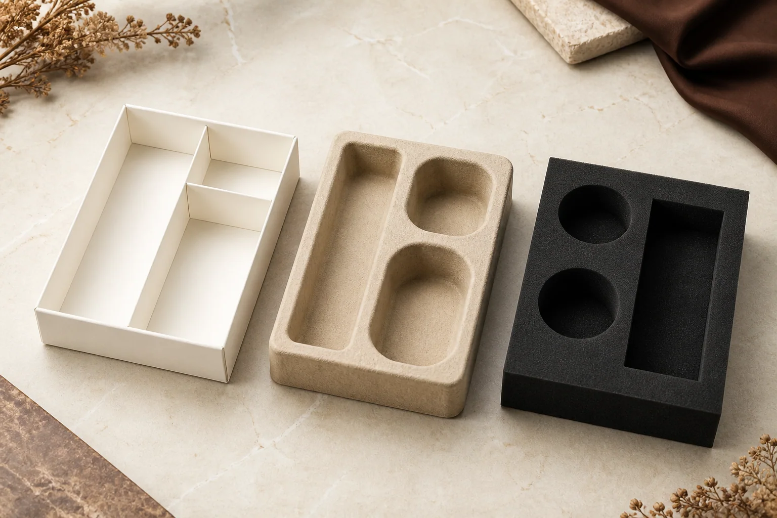
Small accessories affect how the packaging opens, packs and presents. Include them in the brief rather than adding them after the layout is approved.
Confirm width, color, visible length, attachment and purpose: decoration, opening assistance or product removal.
Specify the finished box they wrap around, the artwork orientation and whether they should slide off or be removed another way.
List the pieces in each packed set, their size and placement, and whether they arrive separately or need assembly.
You do not need to know every specification. Separate your must-haves from the details you would like us to recommend.
Answers to the choices that often sit between a design idea and a workable packaging specification.
Ask about your designNo. In a wrapped rigid box, the outer paper provides the visible surface, while the board underneath forms the core. Specify the wrap and core separately. A corrugated mailer uses a different construction; the right material description depends on the box structure.
Not necessarily. The paper shade, surface and final finish affect the result. Identify the actual stock alongside your color reference and review a physical sample. A Pantone reference or screen preview alone does not guarantee identical appearance across different materials.
They can be considered together, but the artwork, paper and alignment need to be reviewed as a combination. Show whether the foil should follow the raised detail exactly or sit elsewhere. Small gaps and fine lines may need adjustment before tooling is approved.
They produce different effects. Foil adds a reflective layer in selected areas; metallic ink is printed onto the stock. Ask for a physical reference of the effect you want rather than specifying only “gold.” Paper choice and artwork coverage should be reviewed before selecting the process.
A fabric surface changes the presentation, but it does not define the support beneath it. Specify the underlying tray or foam, the product positions and how each item is removed. Review fit with the actual products rather than selecting the lining in isolation.
Send a reference image and describe what you notice: reflective, textured, recessed, raised, matte or soft to the touch. Mark the areas you want to reproduce and list your priorities. We can review the effect with you without treating the reference as a guaranteed production match.