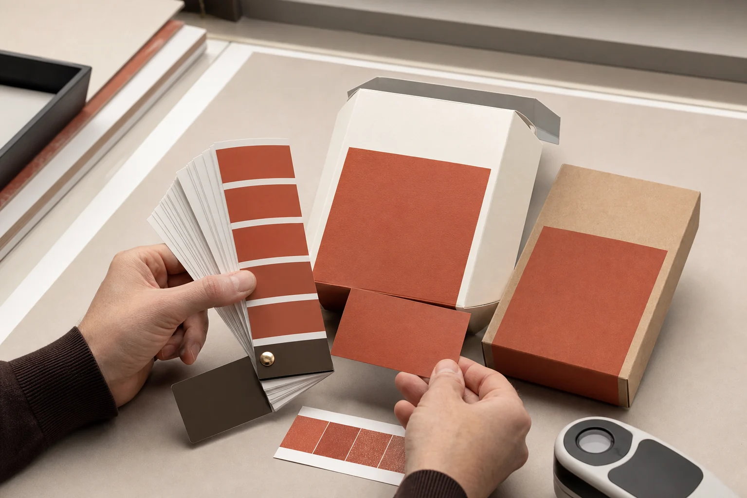
Custom packaging color matching becomes expensive when teams approve different things. The designer approves a bright RGB mockup. The buyer names a Pantone color. The printer converts artwork to CMYK. The factory prints on kraft board and adds matte lamination. Each step can be internally reasonable while the final box still looks “wrong.”
Reddit discussions show the same failure pattern. One buyer received 20,000 printed bags that looked far from the stated Pantone target after approving only a digital proof. Packaging designers describe repeated dieline and CMYK changes without clear press specifications. Other threads ask why the same Pantone appears washed out on plastic, why coated and uncoated samples differ, and whether a premium digital mockup can ever predict varnish and paper behavior. [1] [2] [3] [4]
1. Start with one unambiguous color target
A HEX or RGB value describes color for illuminated screens. It does not define how ink will interact with white coated paper, absorbent kraft stock, dyed paper, plastic film or a metallic surface. Automatic conversion can produce a useful starting point, but it is not a production agreement.
What is the target?
Name the physical swatch, approved drawdown or signed press sample that has priority over on-screen appearance.
How is it produced?
Record spot or process inks, print method, substrate color, white ink or underprint, lamination and varnish.
How is it judged?
Agree viewing light, sample position, measurement method, tolerance and who can approve or reject.
If a brand guide lists RGB, CMYK and Pantone values that do not visually agree, stop before artwork approval. Ask the brand owner to choose the controlling physical reference and document any channel-specific alternatives. A packaging supplier cannot reliably match three contradictory targets.
2. Pantone vs CMYK: choose by artwork and risk
Adobe defines process color as combinations of cyan, magenta, yellow and black. A spot color is a premixed ink used instead of, or in addition to, CMYK. Spot inks receive their own separation and can reproduce some colors outside the process gamut. [5]
| Decision | CMYK process | Pantone / spot color |
|---|---|---|
| Best suited to | Photography, gradients, illustrations and artwork with many colors | Critical brand colors, limited-color designs, metallic or special inks |
| Color creation | Four process inks combine as halftone dots | Premixed ink printed on a dedicated plate or unit |
| Consistency question | Profiles, press condition, separations and substrate affect result | Ink formula, film weight, substrate and press condition still affect result |
| Cost driver | Usually efficient for multi-color artwork | Each additional spot ink may add setup, plate and wash-up cost |
| Proof strategy | Calibrated contract proof can model process output within its limits | Physical ink drawdown or production-intent press sample is stronger than a composite digital proof |
Spot color is not a guarantee that every material will look identical. It gives the workflow a named ink target and dedicated control, but paper, opacity, coating and ink laydown remain visible. CMYK is not automatically inaccurate; it can be repeatable when the conversion, press condition and proof are defined.
For a box with photographs plus one critical brand color, a five-color plan—CMYK plus one spot—may be appropriate if budget and equipment allow. For an ecommerce mailer with two flat colors, two spot inks may be simpler. Ask the manufacturer what the selected press can actually run before finalizing the artwork.
3. Expect the substrate and finish to change appearance
Pantone explains that coated and uncoated guide suffixes describe appearance on different paper types. Ink sits more on coated paper and absorbs more into uncoated paper, so the same ink formula can appear substantially different. [6]
- White coated paper: offers a bright, relatively consistent base for process and spot printing.
- Uncoated white paper: absorbs more ink and usually looks softer or less saturated.
- Kraft or colored paper: changes the reflected color unless opaque white or another underprint is used.
- Plastic film: transparency, white backing, reverse printing and film gloss affect appearance.
- Matte lamination: can soften contrast and shift perceived depth.
- Gloss or UV varnish: changes reflectance and can make the same ink appear darker or more saturated from some angles.
Approve the combination, not the ink in isolation. If the same brand color appears across a folding carton, rigid box wrap and shipping mailer, each structure may need its own achievable specification rather than one numeric recipe copied everywhere.
4. Use a proof that answers the right question
A digital sample from a different machine may be useful for structure and approximate appearance but cannot prove offset, flexographic or gravure color. Label every approval: “layout only,” “process color contract proof,” “spot ink drawdown,” or “production color standard.” Ambiguous words such as “sample approved” create avoidable disputes.
5. Treat Delta E as a method, not a magic number
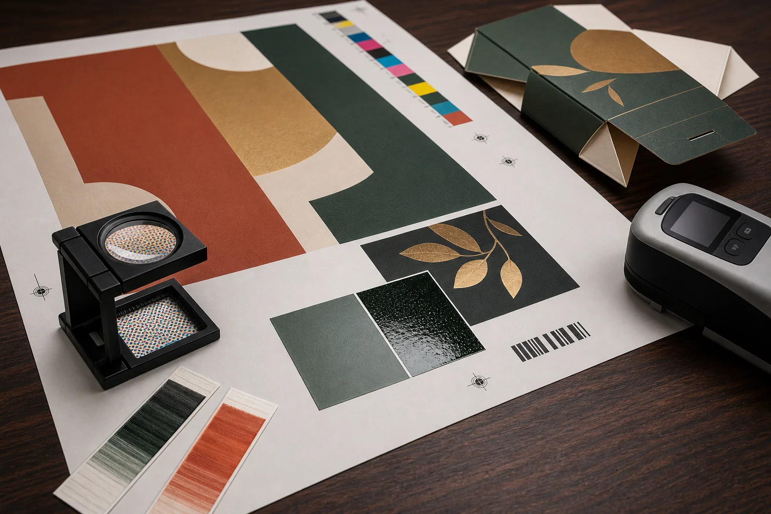
Delta E expresses the magnitude of difference between a sample and a known standard. The number is meaningful only when both parties use the same reference, calculation, instrument approach and measurement conditions. X-Rite recommends selecting one calculation method, specifying exactly how it is used, applying it consistently and confirming numeric tolerances with visual judgment. [7]
Before a supplier promises “within Delta E 2,” ask: which Delta E formula, measured against what standard, using which illuminant and observer setting, on which backing, and whether gloss is included or excluded? X-Rite also notes that illuminant settings and backing material can change print readings. [8]
A single average can hide a local problem. Measure representative positions and inspect visually under agreed lighting. Color tolerance should be realistic for the substrate and print process; stricter is not automatically better if it cannot be repeated in normal production.
6. Prepare artwork for the manufacturer's workflow
Use the manufacturer's final dieline and keep it on a clearly named non-printing layer. Extend artwork through the requested bleed, keep logos and small text away from cuts, folds, glue zones and drill holes, and confirm overprint settings. Adobe's separation guidance recommends previewing separations and overprinting and checking commercial-printer requirements before output. [9]
Preflight before sending files
- Final structural dieline version and dimensions
- CMYK document mode unless the printer specifies otherwise
- Spot colors named consistently and preserved as spot swatches
- Linked images at suitable effective resolution
- Fonts outlined or packaged as agreed
- Bleed, safe zones, folds, cuts and glue areas checked
- White ink, foil, varnish and embossing on separate named layers
- Black text and barcode construction confirmed
- Overprint and transparency preview completed
- Export preset and PDF standard confirmed with the supplier
Do not redraw production dielines from a generic online template when the supplier has issued a final tool file. Reddit packaging designers repeatedly emphasize that the vendor's dieline reflects its machinery and workflow. If dimensions change, request a revised controlled file rather than moving cut marks by guesswork. [2]
7. Control color during production and reorders
Before the full run, confirm the approved standard is available at the press and that the operator knows which element is color-critical. Record ink name or formula, substrate batch or specification, coating, press, measurement settings and approved sample identification. Photographing a swatch beside a box can document a conversation, but a phone camera and uncontrolled light should not replace the agreed physical and measured standard.
Keep approved production samples from the beginning, middle and end of the run when the volume or risk justifies it. For reorders, compare against the retained standard and review any change in paper, lamination, ink supplier, press or converter. A reorder produced from the same PDF is not necessarily the same physical color if the manufacturing conditions changed.
If production arrives off-target, separate objective questions from preference: Was the correct ink or separation used? Was the specified substrate and coating used? Does the sample meet the written measurement tolerance? Was the proof color-binding or layout-only? The answers determine whether the issue is conversion, expectation, process variation or nonconformance.
8. Give the packaging supplier a quote-ready color brief
Include these details
- Physical target or exact named color reference
- Pantone coated or uncoated suffix where relevant
- CMYK, spot or mixed-color plan
- Selected substrate and surface color
- White underprint or opacity requirement
- Matte, gloss, soft-touch or varnish finish
- Print method and intended press if known
- Proof level required before production
- Viewing and measurement conditions
- Acceptance tolerance and approval owner
Ask the quotation to separate process printing, each spot ink, white ink, plates, color drawdown, press proof, lamination and special finish costs. Then use the custom packaging sample approval checklist to connect color approval with structure, fit and workmanship, and the custom packaging cost guide to compare complete supplier offers.
Packaging color matching FAQs
Is Pantone more accurate than CMYK for packaging?
A dedicated spot ink can improve control for a critical brand color and reproduce colors outside the CMYK gamut, but substrate, finish and press conditions still matter. CMYK can be consistent when the workflow and proof are controlled.
Why does my printed box look different from the screen?
Screens emit RGB light; packaging reflects light from ink, paper and coatings. Display calibration, color conversion, substrate color, ink absorption and finish all change the result.
What is the difference between Pantone C and U?
C and U show how a Pantone ink appears on coated and uncoated reference papers. The absorbency and surface of the paper create different visual results.
Can a digital proof approve a Pantone spot color?
It can verify layout and simulate appearance, but it normally does not print the actual premixed spot ink on the production substrate. Use a drawdown or production-intent press sample for color-critical approval.
What Delta E should packaging use?
There is no universal number. Agree the formula, target, material, instrument conditions and realistic tolerance with the supplier, then confirm the numeric result with controlled visual assessment.
Discussion and technical sources
Reddit discussions are qualitative buyer and designer experiences. They identify recurring risks but do not replace a project-specific print specification.
- Reddit: Terribly matched colors back from the printer — digital-proof and Pantone dispute.
- Reddit: Product packaging dielines—who does what? — vendor files, bleed and prepress responsibility.
- Reddit: Packaging color difference issue — mockups, drawdowns and press proofs.
- Reddit: Pantones on plastic packaging — substrate, white backing and proofing.
- Adobe: Spot vs process colors.
- Pantone: Coated and uncoated terminology.
- X-Rite: Color space vs color tolerance.
- X-Rite: Why color may be wrong on press.
- Adobe Illustrator: Print color separations.
Color-ready packaging development
Bring the target, substrate and finish into one approval.
Share your artwork, physical brand reference, box style, materials, quantities and color priorities. Triya Gift can discuss process, spot-color, proofing and finish options before custom packaging production.
Request packaging print options